One forecast is one possible outcome. An ensemble shows what else could happen.
TrekWeather summarizes the member spread inside four ensemble systems, GFS, ECMWF, GEM, and Google WeatherNext 2, then compares their ensemble means to show where the systems agree or disagree.
Ensemble spread is guidance about predictability, not proof that a forecast is correct. Use it as one planning input alongside official forecasts, alerts, and current conditions.

Two different kinds of uncertainty
First, each ensemble system produces many forecast members to sample a range of possible outcomes. GFS, ECMWF, and GEM vary inputs to physics-based simulations. WeatherNext produces its members with a learned model trained on decades of past weather.
Second, the systems can disagree with each other. Comparing their ensemble means shows whether that disagreement is larger than the spread inside any one system.
What TrekWeather draws
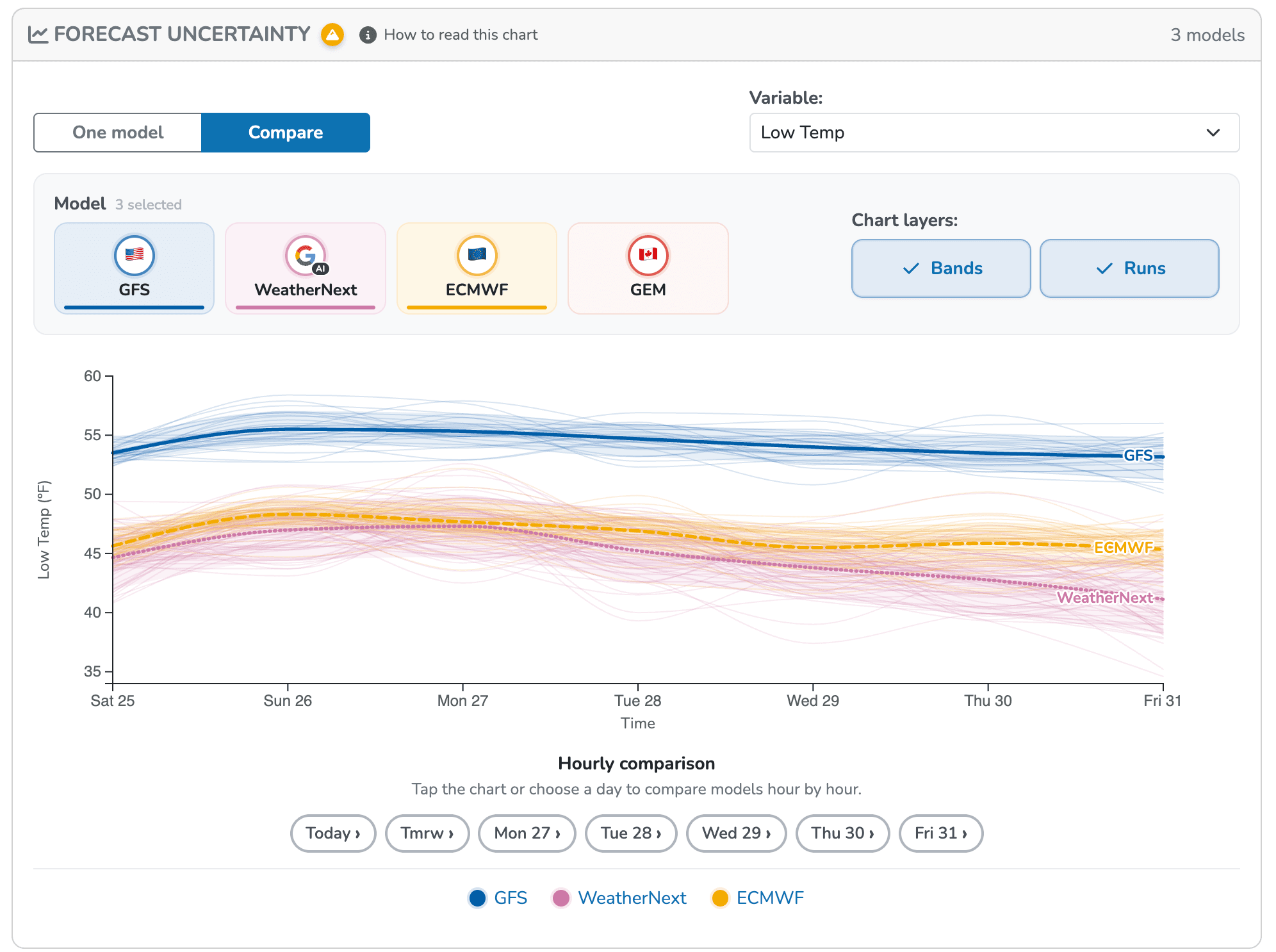
Each solid comparison line is the arithmetic mean of the available ensemble members. Each shaded band runs from the 10th to the 90th percentile, covering the middle 80% of member values. Outcomes outside that band remain possible, and all members can still share a model bias or miss a local weather effect.
Read the chart in ten seconds
Start with the shape, not the exact number. The width of each percentile band and the distance between ensemble-mean lines show two different sources of disagreement.
Tight range
The runs mostly agree
A narrow band means the middle 80% of ensemble members cluster together. That suggests greater predictability within this ensemble, but it does not guarantee the forecast is right.
Wide range
The outcome is still unsettled
A broad band means the middle 80% of ensemble members produce meaningfully different values. Keep flexibility in the plan and check back as the forecast updates.
Models split
The ensemble means disagree
When the mean lines diverge, the systems disagree on the expected value. The practical difference may be timing, intensity, or both, depending on the variable. A split between WeatherNext and the physics models is worth extra attention, because those systems reached their forecasts by different methods.
Use both model views
The Forecast Uncertainty card separates two jobs that are easy to mix up.
Explore possible outcomes
Choose GFS, ECMWF, GEM, or WeatherNext. Runs shows the individual member forecasts, while Range summarizes the middle 80% of member values around their mean. Both views are available during the free preview, and Premium keeps them available without the interaction limit.
Find agreement and disagreement
Put the ensemble means on one chart, optionally show each system's percentile band, and tap any available day for the hourly comparison. This shows whether the systems tell a similar story.
How to use it before a trip
Compare possible trip days
A day with tighter ranges and stronger model agreement is usually the easier planning target.
Inspect the exposed hours
Tap a day to compare models hour by hour during the summit, ridgeline, river crossing, or long exit that matters most.
Keep a backup plan
Wide ranges are useful information. Shorten the objective, move the start time, or choose terrain with an easier escape.
Put it into practice
Find the forecast you can plan around.
Try Forecast Uncertainty on a real location. Free users can explore it before the Premium limit appears.